
We are Proud to Share a New Look for Folklore Magazine!
For the first time in more than 20 years, Folklore has a new look!
Our new design is ready to share with the world! We’ll tell you all about it shortly, but first, we must start with the history!
A Folklore Cover Timeline
Folklore’s layout has changed many times. The first edition, Summer 1979, featured a paper scroll, the name “Folklore” in a handwriting-style script, and the SHFS log cabin logo, conceived by then-past president John Constantine.
1979

Cover of the first edition of Folklore Magazine, Summer 1979.
The image spoke to a real-life log cabin near the Battleford-Fort Pitt trail that was:
“…encompassed by big stately poplar trees and clumps of willow, together with an abundance of raspberry, saskatoon, buttercup, prairie lily, and attendant birds and animals."
-John Constantine, Folklore Summer 1979 [1]
You can learn more about the history of that log cabin image here.
1980s
The log-cabin cover was used for the first six editions. Then, in summer 1981, the Folklore masthead and logo were moved to the top of the page. Covers began to feature a historic photo.

Folklore Autumn 1983.
According to the late Richard Wood, editor of Folklore from 1979 to 2000, the switch to using a photo on the cover was not without controversy:
“Well, there was another incident that matched it for contention and discussion and making for a long meeting. This had to do with putting a photograph on the cover of Folklore ... or not. The covers of the first six issues featured an oversized image of the SHFS logo, and were identical...The upstart editor thought we should switch to having a picture on the cover. Such images had appeared on inside pages since the beginning, so to me, a cover photo didn't seem like such a drastic change. Eventually, the idea carried, but not before almost closing time for the building where we were meeting.”
-Richard Wood, Folklore Autumn 2007 [2]
The above format continued for nearly 10 years, until 1988. The cover paper during this period was a soft, matte, lightweight cardstock. As the decade wore on, the colours solidified into a pattern of orange in autumn, blue in winter, goldenrod in spring, and yellow in summer.

Folklore Magazine cover colours, 1980s: Orange in autumn, blue in winter, goldenrod in spring, and yellow in summer.
Covers followed a seasonal pattern for most of Folklore’s history, although changes in available paper stock resulted in experiments from time to time:
“For its first 20 years and a bit, the cover colour of Folklore rotated seasonally. Though we tried for consistency year-to-year, that wasn't always possible, as paper suppliers frequently discontinue some lines of stock. At times, experimentation was necessary, which usually worked out fine, but there were a few covers we would have liked to have had back. That being impossible, we simply moved on to another hue for the next issue.”
-Richard Wood, Folklore Autumn 2007 [3]
In 1988, a refresh reorganized the masthead and logo, removing the surrounding boxes. The covers maintained the same seasonal cycle as before, but with softer, more subdued versions of each colour, and a switch to pale grey for summer. The ‘year of publication’ was added on the magazine’s 10th anniversary in 1989. This style would continue through the first half of the 1990s, with minor changes.

Folklore Magazine, Autumn 1989.
1990s
On the 14th year of publication in 1993, the “Saskatchewan’s Yesterday’s Personified” tag line was introduced. The practice of noting the year of publication was reintroduced and continues to this day.

Folklore Magazine cover, Summer 1993.
In Spring 1996, the “Travellerscript” font masthead with its stylized “F” was introduced.

Folklore, Spring 1996.
The period from 1996 to 2000 was a time of colourful cover paper, featuring vibrant pink for autumn, blue for winter, lilac for spring, and green for summer.
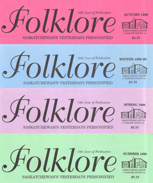
Folklore Magazine cover colours, late 90s: Pink for autumn, blue for winter, lilac for spring, and green for summer.
2000s
Starting in 2000, covers changed to the ‘wheat’ colour we are familiar with today. Then, in 2004, the paper was changed to a heavier glossy stock. Except for a switch to colour photos (usually an Everett Baker slide) starting in 2014, this is how Folklore has looked until the present day.

Folklore Summer 2024.
2025
After over 20 years, it was time for a new look!
Personal and local histories have perennial interest, and as such, so does Folklore. So, we needed a cover that would serve this vital repository of the past well, as it moves into the future. We wanted something that could reference the magazine’s long history, while providing a fresh visual appeal for readers old and new alike.
Above all, we aimed to communicate to new readers what long-standing readers already know: that history is alive, and matters, and there is a whole community of history-lovers, young and old, awaiting you within these pages.
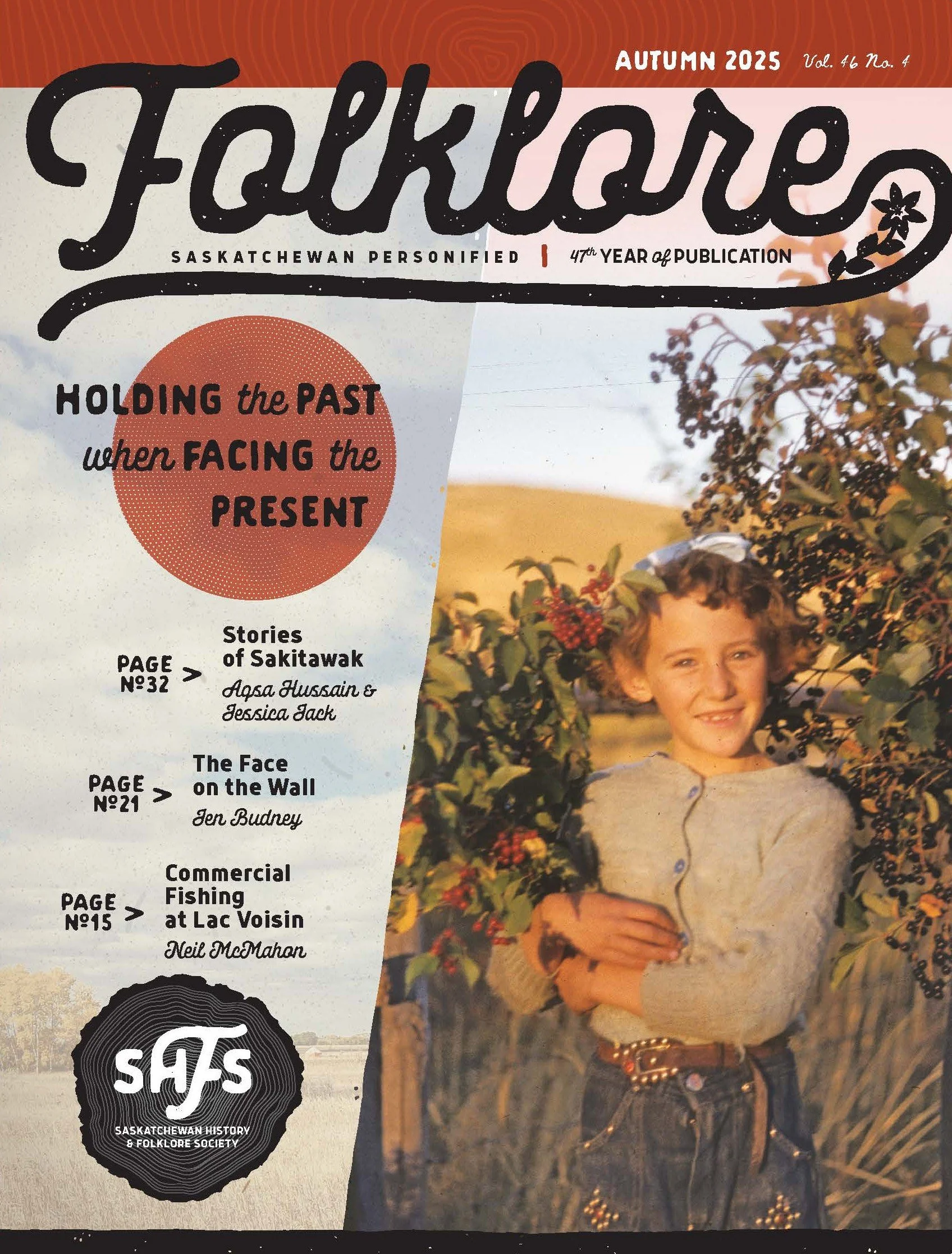
Folklore Magazine, Autumn 2025. The cover image is Gail White, photographed by Everett Baker in Eastend, September 1952, holding pin cherries and choke cherries. For the whole image of Gail (with Raymond White), see here. Everett Baker Slides, SHFS_2219.
Our redesign journey began in the fall of 2023. We learned that we could apply to the Canada Periodical Fund (Business Innovation Component) for funds to hire a graphic designer. When, in the spring of 2024, our application was successful, the board struck a Folklore Redesign Committee, and we set to work.
Over a dozen graphic design companies and individuals from across Canada responded to our call. After a lengthy interview process, we were pleased to award the job to Mr. Tim Neal of The Engagement Party, based in Saskatoon.
To give direction to Mr. Neal, we began, as a committee, by reviewing our values for the magazine. We were informed by our Member Survey (2017), the Folklore Magazine Survey (2021), and by many personal conversations with readers over the years, which provided insights about what makes Folklore special:
Personal experience stories, family, community, local, and regional stories and histories.
Unique stories that shed light on life in Saskatchewan.
History of daily and everyday life.
History that sees broader events through a personal, local, or regional lens.
To add to this list, one thing the committee stressed, early on, was that we wanted to honour what had gone before, as well as move into the future.
SHFS staff compiled a list of practical considerations that could influence the design. Examples include the size and types of photos we typically feature, as well as the needs of editors as they lay out the magazine.
With all this information in hand, the committee created a vision for the values and elements we wanted to convey on the cover. These are discussed below, along with the aspects of the new design that speak to each value.
Value 1: We are the “people stories” magazine
The new cover seeks to embody the personal in several ways. First, we have continued the tradition that the cover must always feature a person.
A new element, however, is our plan to feature closer views that show more of the details of people’s faces. In addition to being visually engaging, this invites the viewer to consider the person’s unique story.

A zoomed-in version of a photo from the Adrian Paton collection.
We should mention, though, that (as always) variety is a hallmark of Folklore’s style! Using closer views of faces is meant to be the general trend, but exceptions are always possible. For example, we may occasionally use photos of personal artifacts, such as handwritten letters or clothing.

Waiter’s jacket from the Zenith Cafe in Wynyard.
You may even see an animal from time to time, reminding us of our relationships with the non-human world.

Pal the pony.
Finally, our committee had many discussions about elements that are evocative of the personal, particularly handwriting. So much so that at one point, we sent our designer several anonymous samples of handwriting, photocopied and clipped out of old handwritten Folklore submissions!
This avenue ultimately didn’t make it (directly) into the final design. Still, it did solidify for us the importance of handwriting in referencing people, writing, and unique stories. As such, our new masthead conveys a handcrafted feel. It also preserves the calligraphic “F’ with its pronounced flourish.

You will find a handwritten touch in the Volume and Number script at the top right, evoking annotations found on old photographs. The “curated” feel is echoed in other places, such as a built-in layer that adds small imperfections (nicks, dust and scratches), to call up the feel of an old photo.
Value 2: Honouring What has Gone Before
Several elements of the new cover reference the history of Folklore. On the cover and throughout the magazine, you will find tree rings. They are present in the graphic banners, spacers, and, significantly, the new logo.
The tree ring motif has several meanings. First, tree rings pay homage to the log cabin logo on the first covers of Folklore. They also symbolize the natural environment, time, and growth.

Graphic spacer with a tree ring motif.
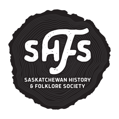
2025 Saskatchewan History & Folklore Society tree ring logo.
The new design is a return to the seasonal covers of past editions. The background on the front and back covers will be a seasonal photo of a landscape. We will change the colour of graphic elements (such as the circle behind the edition title) with each edition. Colours will be drawn from, or be complementary to, the colours of the main cover photo (the one featuring a person), in keeping with the season. This makes the magazine recognizable, but keeps the cover from becoming static.

Background cover photo for the Autumn 2025 edition of Folklore.
Finally, as noted above, our committee felt it was essential to preserve the calligraphic “F” that has been a feature of the Folklore masthead for many years. The new masthead design maintains an homage to the scrolling loops of the “F” in previous masthead.
Value 3: Significance of the Land
Like the rings of growth around a tree, it is incredible how some things seem to come full circle. We’ve often mentioned around the board table, of late, that stories in Folklore articulate relationships to place and environment (consciously or unconsciously, directly or indirectly), much of the time. As such, we represented the land in several ways in the new design. The cover background, as noted above, is a seasonal photo of a natural Saskatchewan landscape. The tree ring motifs recall the environment, nature and plant life. Last but not least, plant life is reflected in the prairie lily incorporated into the masthead.
We are so pleased that these elements not only articulate our values (past and present), but also the history of our organization. Valuing of place, landscape, and the natural world is evident on the first 1979 cover of Folklore, which features the Constantine log cabin. That image represents a memory of a place inseparable from its environment —the natural landscape, the plants mentioned by name, the animals, and even the log construction.
“In those days, it was encompassed by big stately poplar trees and clumps of willow, together with an abundance of raspberry, saskatoon, buttercup, prairie lily, and attendant birds and animals."

Folklore’s New Interior
What can we expect from the inside pages of the new Folklore? The same local, regional and community stories as always, but in a format designed to be distinctive, highly legible, and easily modified. The title fonts and overall aesthetic are inspired by vintage signage. The main text font is sized and spaced according to best practices for legibility. The inside cover photo and accompanying caption are much larger. We have given our donor acknowledgement page more prominence on the inside back cover. Finally, you will find that our quarterly SHFS Bulletin has a new home on the last four pages of this magazine. The four centre pages (after this edition) will be reserved for colour magazine content.
What's Next?
Is this the final iteration of our new design? In a word, no. We have worked hard to build a good base that is now ready for you, the readers, to comment on. We can't promise to accommodate every suggestion, as some changes are easier to make than others. Still, we would love to get a sense of what elements you love about the new design, and what elements you wish were different.
Based on the feedback we receive, there may be some changes in the following few editions as we find our feet with the new template. And Folklore is, of course, alive! So, refinements will be ongoing. Still, we aim for future improvements to be made with intentionality, in the context of a cohesive style guide, to produce a consistently professional layout. Our stories deserve nothing less!
You can let us know your thoughts by contacting our office by email, mail, or telephone.
Thank you!
There are many people to thank. As I’ve mentioned in other venues, I must first thank our members for responding to surveys and sharing with me the value of “people stories.” Without that understanding, passed on to me by many valued friends of the Society (some of whose memories extend to the earliest days of the magazine), none of this would be possible.
Thanks go to our Redesign Committee: Laura Larsen, Taryn Goff, and Hannah Tran, who all offered insightful observations born out of a deep affinity for the magazine and the SHFS. Whenever I was stuck and couldn’t see the way forward, one of them (each in turn) always had an answer, and the solution was always exactly right, grounding us back in our values. I am so grateful they all contributed their time, experience, and insights to this process. Thanks also go to Hugh Henry and Patrick Lee, who each contributed many valuable insights. I want to thank the SHFS Board, which championed the process and provided excellent starting guidance for the committee.
I want to thank Tim Neal of The Engagement Party for a great creative vision and endless patience with revisions!
Many of us aren’t fans of change (myself included). Still, I hope even those who miss the old cover will eventually find something to love in the new one. It's all right to mourn the old one, too - it served us well for over 20 years. But, regardless, the values of connection through daily life, personal, and community histories are still the same. And as long-time Folklore Editor, the late Richard Wood, once said about organizational change:
“History shouldn't and doesn't stand still, for anybody or any thing, including the province's most important history preservation organization. If it did, there wouldn't be much for us SHFS folk to do.”
- Richard Wood, Folklore Autumn 2007 [4]
Here’s to a new visual chapter in the story of Folkore Magazine!
Kristin Enns-Kavanagh
Executive Director
August 2025
We gratefully acknowledge Canada Periodical Fund for funding this project.

Notes
Wood, Richard, “About our Cover and Logo,” Folklore Magazine, Summer 1979, page 32.
Wood, Richard, “Putting history on the record,” Folklore Magazine, Autumn 2007, page 21.
Wood, Richard, “Putting history on the record,” Folklore Magazine, Autumn 2007, page 24.
Wood, Richard, “One man’s journey with SHFS,” Folklore Magazine, Autumn 2007, page 18.